change
region
medium
issue
diane.kirksey1@...
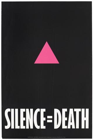
This is a prime example of the marriage of art and activism. The Silence = Death poster is simple but extremely powerful representation of the obstacles the AIDS movement was facing (suppression of gay people + their problems, lack of awareness surrounding the pandemic).
NY TIMES:
In the early years of the AIDS epidemic, the government and mainstream media infamously ignored the crisis. By the time President Reagan finally uttered the word “AIDS” in 1985, 12,000 Americans had already died. That same year, six men in New York City — Avram Finkelstein, Brian Howard, Oliver Johnston, Charles Kreloff, Chris Lione and Jorge Socarrás — began meeting to privately share their experiences of AIDS-related loss in the absence of public discourse. Inspired to create something tangible that could spread awareness, they swiftly settled on a poster. It should have little (if any) text, they decided. “Manifestos don’t work,” Finkelstein recently wrote. “Sentences barely do. You need sound bites, catchphrases, crafted in plain language. The poster is exactly that, a sound bite, and vernacular to the core. The poster perfectly suits the American ear. It has a power. If you’ve ever stopped in front of one or turned your head for a second look, that power was at work.” The result of their collaboration, a hot pink triangle (an inverted version of the symbol Nazis used to label gay men) emblazoned on a black background above the slogan “Silence = Death,” made its debut in 1987. The six friends hired wheat-pasters to cover the East Village, West Village, Times Square, Chelsea and the Upper West Side — neighborhoods chosen to reach both queer audiences and the media — overnight, and the city woke up to what became the most enduring icon of H.I.V./AIDS-related activism. Later that year, on April 15, members of the newly formed activist group AIDS Coalition to Unleash Power (Act Up) stormed the city’s General Post Office carrying copies of the sign, solidifying its ongoing centrality to their cause.

![]()
![]()
![]()